For mobile users: This page is best viewed on a desktop. To view this case study on Figma, click here.
the wellnest
case
study
UX Research
Wireframing
Product Design
Branding
Prototyping
User Testing
Figma
Typeform
Instagram Polls
WebAim
tools
my role
result
Mobile App Design
Cross-Channel Experience Alignment

Navigating health coverage is a uniquely American challenge that often feels confusing and isolating.
Even with apps designed to assist people with specific insurance plans, many still find themselves overwhelmed in urgent situations, unsure where to turn for reliable information without the risk of unexpected costs.
I set out to explore solutions for this complex landscape and identify the most significant pain points tied to these challenges.

Preliminary Surveys
users choose a Topic

I wanted my final capstone project to be completely absent of personal bias or desire, driven only by the people’s needs.
The first step I took was engaging my 900 instagram followers to explore general interests through it’s survey tool.
First survey, 22 responses to choose a topic: 50% of users voted for Healthcare as the preferred topic.
I ran a second survey, 27 responses to refine the topic within Healthcare: 52% of users selected Health Insurance as the area of greatest interest.
Objective: To refine a design topic that aligns with my target audience's preferences and needs by using Instagram polls for insights.
Demographic: American Adults, Age 28 - 56 (980 followers total, non-private instagram page)
interview Prep
assumptions and Hypotheses
Since users chose Health Insurance as their topic, it was an intimidating area to explore — broad, controversial, and highly litigated. I decided to prepare for interviews by asking general questions, hoping this approach would reveal patterns I could investigate further.
Click here to view files in Figma.
Searching For Answers
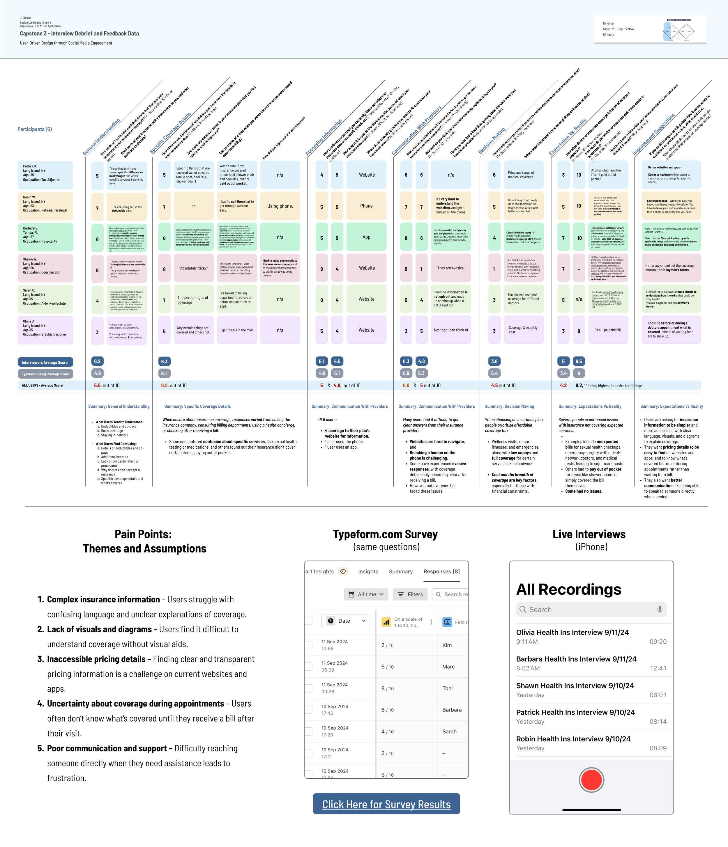
User Interviews
I set out to conduct interviews with a broad range of American participants, posting the Typeform survey link on my Instagram with the same questions I asked in-person. Both methods proved to be insightful, with participants providing rich and thoughtful responses, whether remotely or in-person.
Participants (14 total)
6 In-Person Interviewees
8 Survey Responses
Method
In-Person Interviews
Online Survey
Discussion prompts
General Understanding
How proficient was user’s clarity on their health insurance coverage?Challenges in Accessing Information
What were the disconnections and emotions associated with the pathways users chose?Decision-Making Confidence
Did users feel empowered in the process of finding important resources?
Key Insight
Users experience significant confusion and frustration, highlighting the need for clearer, more accessible health insurance information.
To view this file on Figma, click here.
To view Typeform survery results, click here.
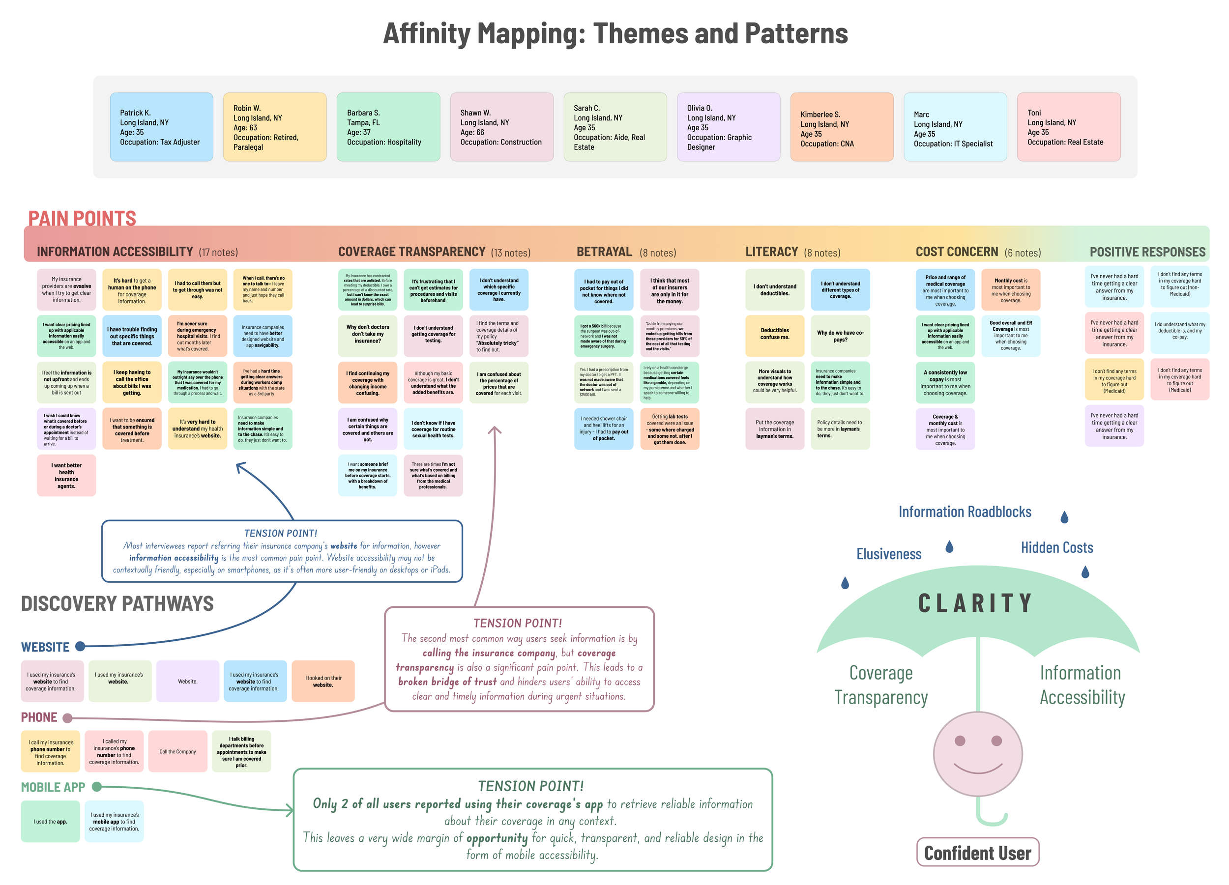
Research Synthesis and
Affinity mapping

While categorizing users' evident pain points from their statements, I observed three significant areas of tension that became clear through the cognitive dissonance they created in my research results. These tension points were closely tied to a single topic in the interviews: Discovery Pathways.
This is a very detailed file, to zoom/view on Figma click here.
1. Website Accessibility
The primary pain point revealed for users was information accessibility, particularly on mobile devices, where websites are often less user-friendly.
2. Transparency Issues with Phone Support
Users reported significant frustration due to a lack of verbal transparency, leading to broken trust and delays in accessing critical information.
3. Underutilization of Mobile Apps
Only 2/20 users interviewed reported using their insurance company’s mobile app for reliable coverage information.
Delving Deeper:
another Survey

Now, I had one burning question:
If healthcare coverage information was needed in emergency and on-the-go situations, why didn’t more users use the apps available to them from their provider?
Method:
Remote Typeform Online Survey
Participants:
I surveyed 9 American citizens (average age: 45), all whom have active health insurance coverage.
Findings:
7 out of 9 knew their insurance provider had a mobile app... only 4 actually used it.
Those who used their app rated it just 3.4 out of 5 on average.
Of the users who did not use it, barriers such as login and poor communication proved their coverage membership apps to be low value to understanding whether their treatments would be covered.
With this information now revealed, I understood the types of features to focus on for competitive research and pattern ideation.
To view Typeform survey results, click here.

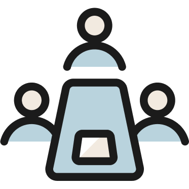
Competitive Analysis :
Evaluating current User Solutions
With a clearer understanding of the usability gap I aimed to address in the market, I conducted competitive research on various open-source healthcare websites, such as HealthBird, Zocdoc, and Oscar’s Member App. Each platform offered distinct features, but my goal was to identify solutions that were universally accessible and user-friendly.
I concluded that I could design a more intuitive platform by addressing the following key areas:
Simplifying navigation for a seamless user experience.
Expanding access to coverage details options to empower users.
Integrating new tech like Ai to provide valuable resources like a health insurance glossary.
Ensuring casual mobile accessibility for all users, not just members.

ideation Crystallization
Marrying Success with Necessity

One night, shortly after compiling all my discovery data, my imagination began to connect the dots. I came home from a friend's house at 1 a. m…. and, eager not to forget my ideas by morning, quickly jotted them down on Post-its and took a photo.
As themes and tensions emerged out of my user and competitive research, I mused on how insurance apps struggle with engagement because the topic feels overwhelming and dry.
The boredom with this topic combined with anxiety makes users avoid interacting with their healthcare needs in general.
And then thought about most successful apps in existence, like Craigslist, Facebook, and Instagram, and how they create a sense of community.
I also reflected on the most successful social media tools of the past decade—what makes them effective? How can I blend recent innovations like AI with what users crave most to address their pain points?
I came to the conclusion that adding a social element will make my mvp more engaging and effective.
The main challenge is finding a way to balance community and privacy, via HIPPA.
Pattern Analysis
Exploring existing Features
Such examples included:
How Facebook users ask for local provider recommendations using their real names—how can we make this private?
RetailMeNot’s live coupon success rate feature, which could be adapted to show live verification of local providers accepting your insurance, based on feedback from other patients in your area.
The technical language used by closed-member apps for navigating healthcare coverage, and how to create an open-source version that’s easy for casual, on-the-go users.
How Reddit’s forum patterns can be transformed into local health community discussions.
To view/zoom into this file on Figma, click here.
Impactful features
what will make this mvp innovative?

Better yet, what kinds of features have never been able to exist before current technologies - like AI? Re-focusing on users' pain points as my “north star” per se, I prioritized feature ideas that would offer the most unique value. The following features don’t exist on public sites like ZocDoc and Healthbird, nor do they appear in closed-member apps specific to healthcare coverage companies.
The Storyboard
Connecting with Confidence
Instead of creating personas, I focused on showing how users would discover the app and how enjoyable it is to use compared to existing healthcare resources.
The story follows a user who needs surgery
but is unsure about her coverage.
She struggles with her health insurance app and feels frustrated.
After failing to log in, her friend introduces her to a new app.
This app connects users with similar insurance policies in their area, offering a safe space to share insights anonymously, unlike Facebook.
The app helps her feel more informed, confident, and less isolated by easily connecting her with others to better understand her coverage.
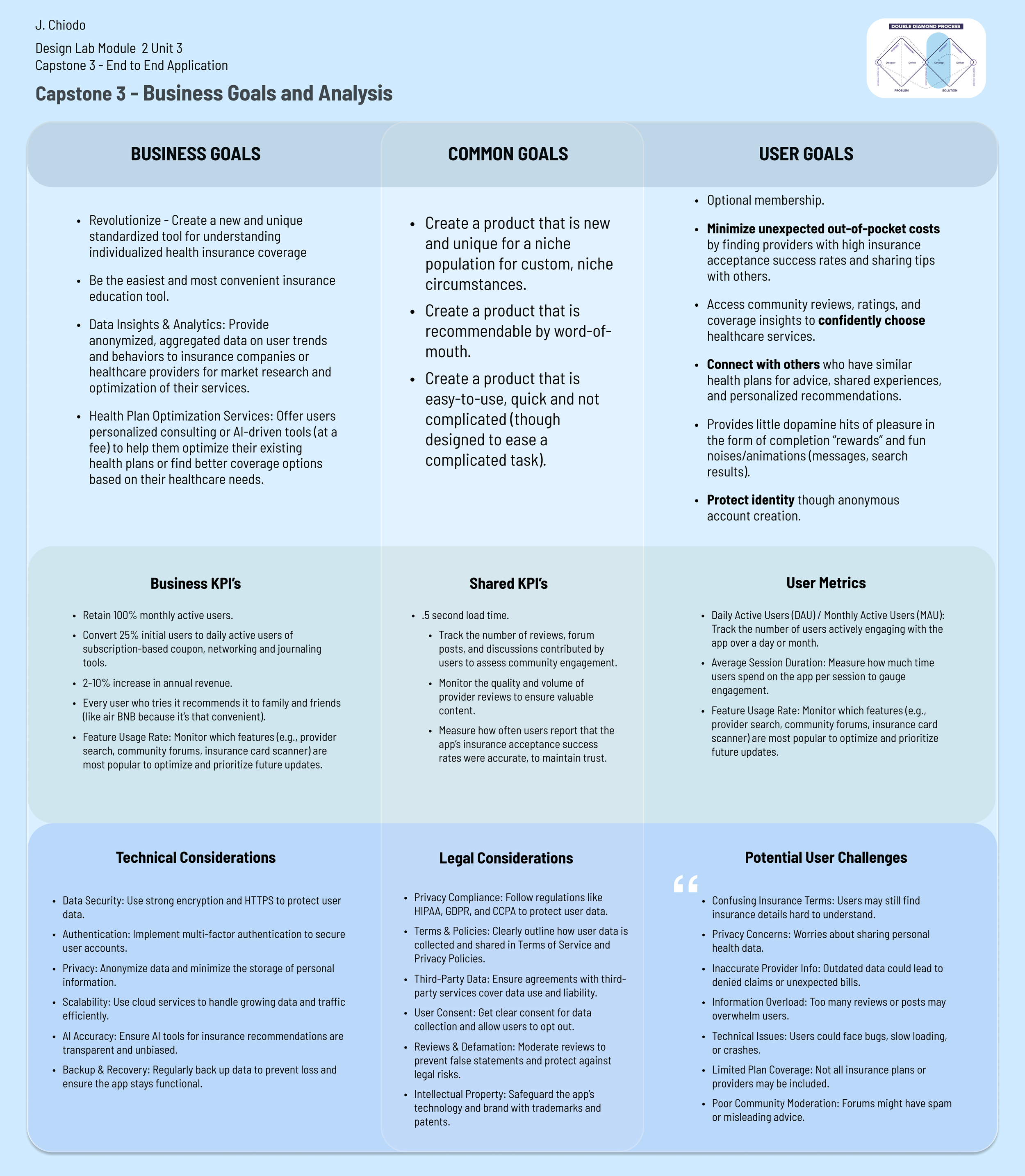
Marketing and Compliance Grid
Covering All Bases
From a business perspective, it was essential to assess how the app could be developed within healthcare regulations and legal constraints, along with the implications of using AI.
With this understanding, I gained confidence to move into the wireframing stage, knowing the boundaries of my features and keeping them as streamlined as possible.
If ever developed, this document would serve as a key foundation, providing talking points for the project team while considering the real-world constraints and efforts needed to bring the product to fruition.
Task Flows
Continuity-Centered Design

Before starting low-fidelity wireframing, it was crucial to define the task flows for each feature. This approach allowed me to align the UX patterns with each step in the flow, frame by frame.
This step was particularly important in this process, considering that the primary goal of my project was to alleviate the pain points caused by disjointed, barrier-ridden, opaque, and fragmented information systems that users had become accustomed to enduring during their healthcare experiences. Click here to view on Figma.
The five interconnected flows displayed here:
Searching
for glossary terms
Using the AI
card scanner
Becoming a member
of the app
Localized
provider search
Accessing
forum discussions
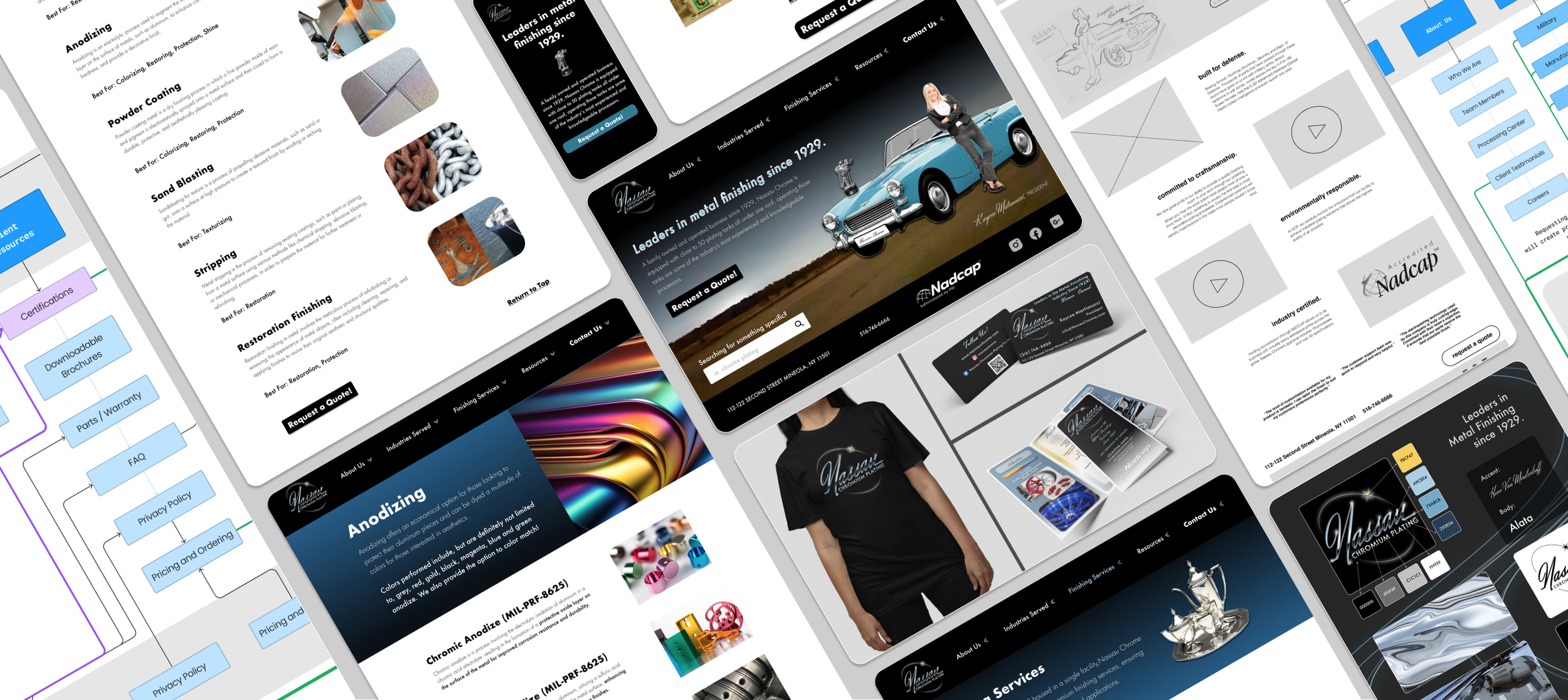
Low-Fidelity Wireframing
features that flow

Using a pre-printed grid of mobile frames on a horizontal page grid, I filled in each frame step with graphite using my task flows for the three features, imagining each UI element. Then, lightly color-coded each flow to distinguish the feature categories.
I simplified the app to its most essential functionality, while creating a clear roadmap for future structuring.
Mid-Fidelity Wireframes
prototyping functionality
From previous projects, I discovered that prototyping and refining flows before developing high-fidelity models is the most effective approach for implementing key usability improvements from user testing. Using the same color-coded flow system, I built mid-fidelity wireframes in Figma, drawing inspiration from other apps to imagine high-fidelity versions of those features.
I then prototyped these elements and presented them in group critiques for feedback, in place of real-world user testing.
name survey
Finding delight in meaning

At this stage in development I was able narrow down the two themes this app represents; Health and Community. However, I still wanted the people to choose the most attractive name for their app. I made a grid of synonyms for each theme to compare the combined names side-by-side so users could view and pick their favorite choice.
The Final result: WellNest. Multiple users commented they liked it because it sounds like "Wellness" and/or could be a more dated internet name, "Well Net".
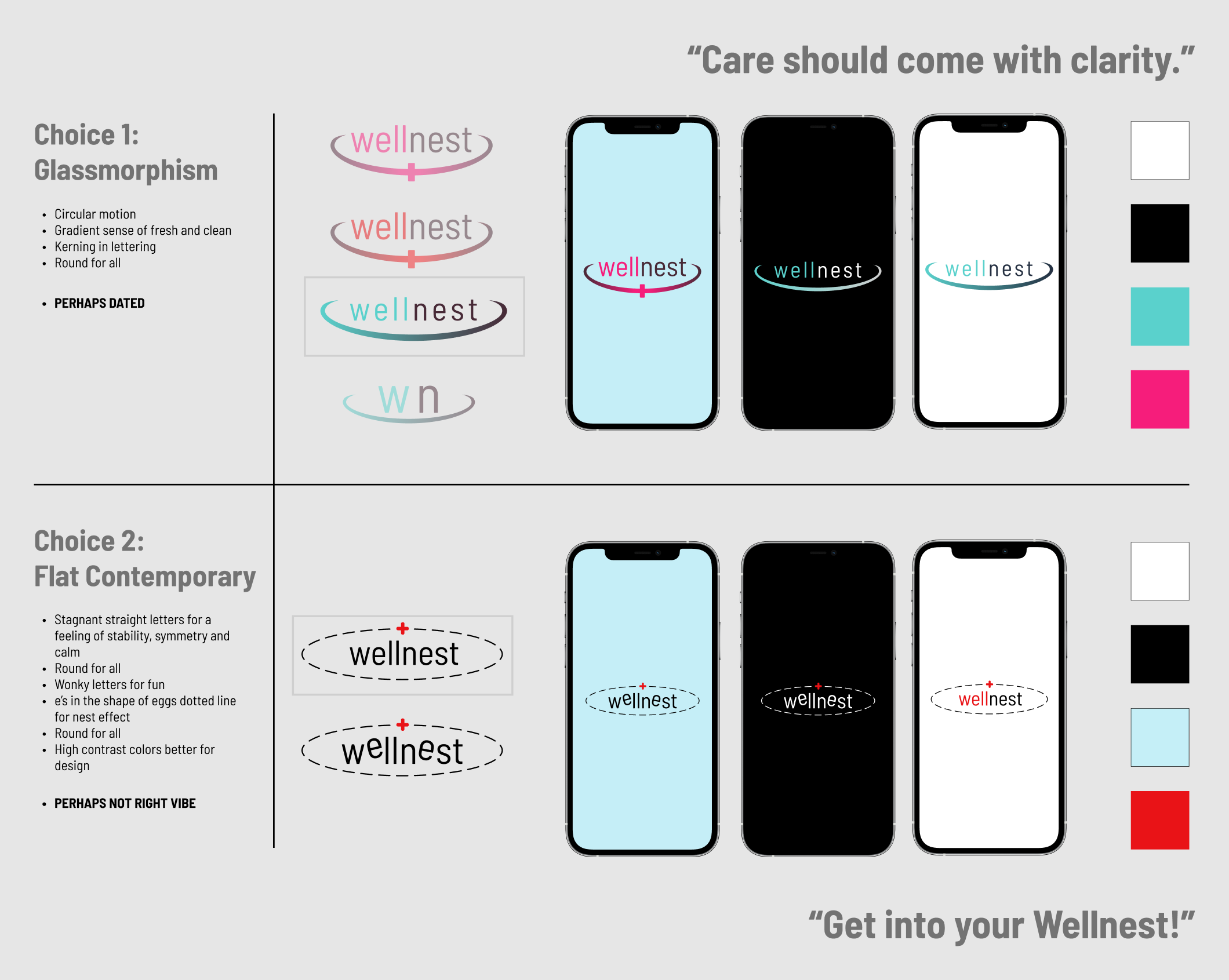
Branding Directive
Corporate Safety
or Grassroots Rebellion?

The time had come to choose a design direction. After competitive research, pattern analysis, and overall feel of the mvp, I had narrowed the choice down to two paths.
One followed the typical healthcare aesthetic with gradients and polished visuals. While it conveyed trust and professionalism, it felt outdated to me as a designer in 2024. After all, I was aiming to help users break away from their biases against the corporate healthcare experience.
The other leaned into the neobrutalist trend, which was bold, visually striking, and felt more friendly and approachable. I wanted an app that balanced excitement and user enjoyment, but I had reservations about conveying untrustworthiness.
After presenting in a group critique —
Multiple students agreed that the neobrutalist aesthetic was a fresher, friendlier choice to pair with the MVP features I had developed.
Final Branding and Ui choices :
Calming neutrals
meet defiant contrasts
My goal for the final app design was to create a visually engaging app that made navigating a traditionally less enjoyable task—managing healthcare information—more approachable.
By incorporating contemporary design elements, such as non-feathered shadows and flat strokes, I aimed to provide a high-contrast interface accessible to users of all ages, backgrounds, and abilities.
I intentionally avoided gradients and the polished “fresh” corporate aesthetic. Instead, I drew inspiration from the understated, “underground” feel of platforms like Craigslist or Reddit. This design choice reflects the app’s purpose of breaking traditional systems and empowering users to share insider information and connections.
Lastly, I carefully selected skin-toned neutrals, acknowledging the criticism Band-Aid faced in recent years for promoting shades aligned with a caucasian standard. While incorporating inclusive colors, I also leaned into healthcare-associated hues like powder blue, tans, and reds, which have long been linked to the field.
hopeful Impact :
Breaking Big Healthcare’s
Misery Bias
Gone are the days of calling multiple practitioners you’ve heard about through word-of-mouth, only to spend hours on the phone to find out they don’t accept your insurance.
Gone are the days of needing to log into your healthcare app, only to be prompted to create a new mobile account because it doesn’t match the website’s login.
Gone are the days of seeing a practitioner listed in your health coverage app, only to call and discover they no longer accept your insurance.
Gone are the days of playing phone tag and receiving cryptic or delayed responses between practitioners and office staff.
Say hello to fast access to answers from the vast internet and people who share your specific coverage. Your community can now support you and vouch for trustworthy, efficient practitioners. Healthcare emergencies shouldn’t have to wait.
WellNest is just that—an app designed to support users, make healthcare enjoyable, and bring clarity and confidence through powerful AI tools and your insurance community. It combines familiar patterns for easy navigation, low barriers to information, and personalized insights from your own community on how to get the best care.
The healthcare future is here: It’s in your WellNest.


You may also like…