For mobile users: This page is best viewed on a desktop. To view this case study on Figma, click here.

the nassau
Chrome
case study
my role
UX Research
Wireframing
Website Design
Branding
Prototyping
User Testing
tools
Figma
Adobe Illustrator
Adobe Photoshop
Apple Voice Memo
result
Responsive Web Design
Experience Optimization
Brand Storytelling

Designing for Recognition: Revitalizing Nassau Chromium Plating Co.'s Century-Long Legacy in Long Island, NY
Background:
In February 2023, Nassau Chromium Plating, Inc. reached out to me to design a new logo. They were preparing for the New York Auto Trade Show in April, and wanted the new logo to feature on their marketing materials.
What they didn’t anticipate, however, was that they had many more questions to address about their brand's direction and presence in today’s media landscape.
Together, we explored the most effective solutions for revitalizing the company’s brand - Ultimately establishing a comprehensive new visual identity to attract new clients and honor their century-old legacy on Long Island, NY.
Hopes and Scope :
Initial Interview at NCP

Nassau Chrome’s marketing team sent me the rough sketch pictured here. As I began iterating their concept with Autodesk Sketchbook on my iPad, I quickly realized that the initial ideas were becoming too complex to execute effectively.
To better understand the company and its needs, I decided to visit Nassau Chrome’s facility and interview the CEO, Kaycee, and her team. This allowed me to gain deeper insights into their goals and aspirations for the brand.
The experience proved to be incredibly valuable! Not only did I establish rapport with a knowledgeable team, but I was immensely inspired by the company’s rich generational history and the tenacity of its staff. Nassau Chrome has worked on impressive projects, including military and SpaceX parts, as well as the iconic Moon Man statue for MTV.
After touring the facility and discussing the brand’s needs with CEO Kaycee and her team, we identified several key insights:
Key Insights:
NCP’s current logo was outdated and did not reflect the brand’s evolution.
The branding primarily targeted industry-specific clients, excluding the general public.
The website was overly technical, verbose, and difficult to navigate on mobile, making it inaccessible for non-experts.
The typography and color contrast were generic and lacked cohesion.
Projects of prestige, such as the MTV Moon Man, were buried within poor information architecture, failing to highlight the company’s generational legacy and female ownership.
Brand Goals:
Revitalize the brand by creating a fresh visual identity.
Redesign the website and improve its social media presence.
Position NCP as a prominent, woman-owned, and historically significant organization.
Click here to read full interview.


The existing site through UX:
Heuristics Testing

When I got home from the facility, the first step I conducted was heuristic testing of Nassau Chrome’s current website (Nassauchrome.com) by evaluating the product using a Nielsen Norman Group Guidelines excel spreadsheet.
Of 120 items of concern:
37 items were flagged as problematic for usability.
Of those 28 items, 17 items were highlighted red for the most concern.
Categories of most concern:
System Vs. Real World (6/14)
Visibility (6/18)
To view full results, click here.

From a Human Perspective :
User Testing

After conducting my heuristic testing, I wanted to understand how other users perceived Nassau Chrome’s site.
Each user had been asked to imagine they are ordering a specific product from NassauChrome.com based on their current profession, from both a desktop and mobile viewpoint, at their convenience.
After touring the site, they were asked to number rate their experience and describe the site in one word.
In addition, open-ended comments of observation were encouraged.
To view data in Figma, click here.
user words
of choice :
average
user rating:
Chaotic
Scammy
Plain
Uninspired
Simple
4.5
out of 10
imperative Issues:
Feedback Severity Grids

Brand Perception:
4/4 users used negative words describe the feeling of the site.
0/4 users mentioned the site’s design sparked interest in learning about chrome, or had gained any knowlege leaving the site about the companies’ heritage.
Although Nassau Chrome had a fully functional, information-heavy site, user testing revealed that any hopes of reaching their goals—such as attracting a private sector audience, sparking interest, and conveying historical significance—were currently being overshadowed by UX concerns.
User Experience:
4/4 users were confused as to what the “Chrome” tab in the drop down menu meant, and why it was highlighted.
4/4 users had suggestions for information re-placement, including the About, Chrome, Ordering, Heritage, Imagery, Tabs and Home pages.
4/4 users were confused on whether the CTA “red” color was pink or red- leading to issues with connotation.
Gender Perceptions:
Of male users, 1/1 surveyed said the site was serviceable and used terms like “simple”.
Of female users, 3/3 surveyed used negative terms such as “overwhelming” and “jarring”.
Competitive
Analysis

SEO:
Many chrome companies include "USA" in their domain names for SEO purposes.
NCP’s domain name (nassauchrome.com) effectively incorporates "chrome," staying true to their brand and supporting customer loyalty.
History:
Many companies boast nearly a century of electroplating history, much like NCP.
The challenge: Making NCP’s website stand out by showcasing their military and parts heritage, while also highlighting single-customer project services.
Information Architecture (IA):
Keep it simple while educating.
Many sites felt cluttered as they tried to sell their product while simultaneously educating visitors about their processes and heritage—especially on homepages.
I conducted a competitive analysis of current metal plating companies' websites, focusing on visual aesthetics, information architecture, and the accessibility of information for users seeking metal plating services. Here’s what I found:
Photography:
Photography can make a significant impact—both positive and negative.
NCP would benefit from investing in professional photos, a mix of stock and their own high-quality images, sized appropriately to avoid visual overwhelm.
Obtaining Services:
The most effective sites feature comprehensive inquiry forms that are easily accessible through responsive sticky notes or prominent header/footer links.
Information Architecture (IA):
Keep it simple while educating.
Many sites felt cluttered as they tried to sell their product while simultaneously educating visitors about their processes and heritage—especially on homepages.
Click here to view full Figma file.

… the logo
had to happen first

Click here to zoom and view Figma file.
After receiving usability feedback on the website, I evaluated the timeline available to meet the company's needs for the auto show.
Since they approached me initially for a logo, I began weekly meetings with the marketing team to delve into the branding identity discussions, which were crucial for refining the brand’s aesthetic direction.
The following story outlines how this process unfolded…

Discovery Conclusions

Next… The UX
assessment continued

After speaking with the management at Nassau Chrome, running usability tests, and diving into competitive research, I was ready to create personas for NCP’s website. This step was key before moving into IA development, as the team wanted to attract a variety of site visitors.
Click here to zoom and view Figma file.
Information Architecture :
Card Sort

One of the key issues for NCP, identified through both competitive and user research, was its information architecture.
The Goal:
To balance homepage accessibility to meet the needs of both laymen and B2B customers, ensuring easy access to NCP’s products, credentials and services.
To address this, I conducted an open, moderated in-person card sort with five participants (three men and two women), with a median age of 57.
The participants came from diverse professions, representing the variety of NCP’s customer base, ranging from mechanical fields to marketing.
The card sort resulted in seven agreed-upon categories, derived from 60 terms gathered from various metal plating sites, including NCP’s.
open
moderated
card sort
five
participants
60 terms
to sort
16 min
28 sec
Task and User Flows
creating discovery

I developed user journey maps for two distinct customer profiles to outline how each type of user would navigate through the site:
A. A homeowner desiring plated kitchen appliances, discovering NCP through a common search engine.
B. An industry worker seeking an industry-specific engineering part, also discovering NCP through a common search engine.
By visualizing these pathways and mapping their interactions, I aimed to ensure that both customer types:
Could quickly discover NCP through SEO.
Would likely stay engaged by learning about their metal-plating options.
Could easily obtain a quote for their desired services.
Would refer back to NCP based on the content representing its reputability (through memory and/or social media).
Click here to view/zoom in on these files on Figma.
site mapping :
Nassau chrome Optimized

After completing the card sort, I moved on to designing a site map. This step was vital in bridging the gap between navigable information accessibility and the new brand aesthetic, providing a clear roadmap for achieving both user satisfaction and NCP’s branding goals.
I used color intensity and arrows to indicate navigation flow and subject hierarchy. The site map was then evaluated in a group critique.
After a few minor adjustments suggested by other junior UX professionals, it was agreed that this provided a solid foundation for proceeding to low-fidelity wireframing.
Click here to view this file on Figma.
Laying It All Out:
Lo-Fi Wireframing

With the site map in place, it was time to unify the informational categories and inspire user exploration with rough UI elements.
Some Implementations:
Standardizing item display under each tab.
Incorporating video content into the 'About' page for each service, promoting site engagement and allowing users to connect with social media, e.g., an NCP channel on YouTube.
Zoom scroll highlighting of options for users to explore.
Removal of confusing elements such as inconsistent headers and unclear navigation, including a red-highlighted 'Chrome' tab.
Click here to view/zoom on these files in Figma.
NCP REIMAGINED :
STYLE TILE

The owners of NCP originally wanted turquoise and yellow incorporated into the new design. Through the branding evaluation, this evolved into blue hues and gold.
The heading font, Alata, is a tribute to the Art Deco period during which Nassau Chrome was established— the 1920s. As a sans-serif font, it is easy to read and is available as a Google font. The secondary font, Futura, was chosen for the same reasons, although it has a much lighter weight, making it suitable for more dense copy.
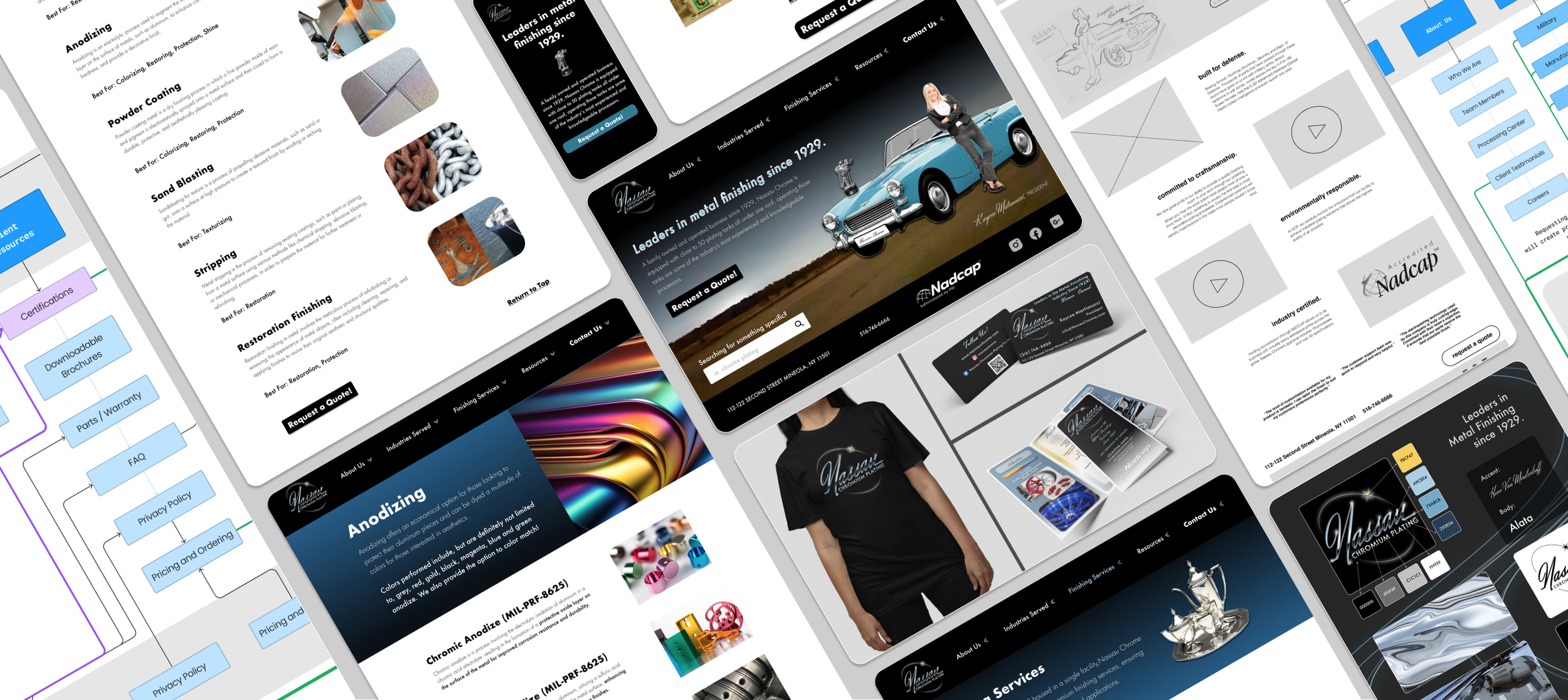
Marketing Materials
The logo is best suited for dark backgrounds, although monochrome, flat versions are available for Xerox printing and screen printing.
The logo, typefaces, and website content were applied to pamphlets, business cards, and apparel.
a new vision :
high fidelity prototyping

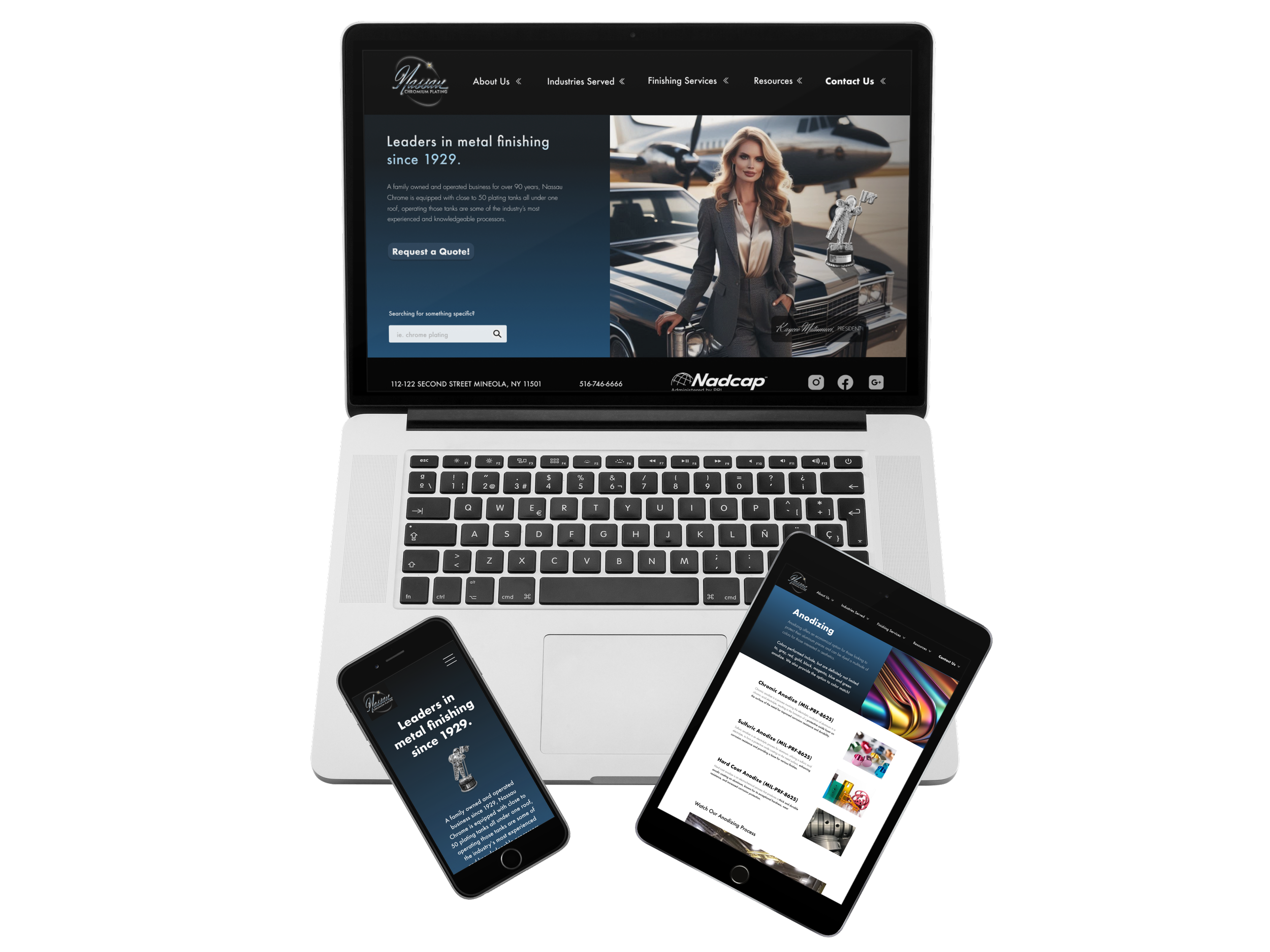
Using the style card created with the logo design, I developed high-fidelity wireframes for the new site.
These prototypes feature 5 desktop screens and 4 mobile screens.
These layouts included exact text and service descriptions from the current website.
Simplicity, contrast, and navigational assistance were the primary focus points.
The design was also reviewed by colorblind users. Coincidentally, NCP’s requested theme color pair of blue and yellow (gold, chrome) resulted in a site with branding that was compatible with both full-color viewers and the most common form of red-green color blindness (which affects 12% of the general population).
Key features of this prototype:
A condensed, simple landing page for desktop users (instead of a long, cluttered homepage).
Reorganized information architecture (IA) with intuitive navigation features incorporated into a unified UI.
Imagery and contrast values compatible for all users, including those who are colorblind.
Certifications and important company information prominently displayed on the landing page with no scrolling required.
Quote and Contact buttons visible at all times.
Female CEO, classic car, and other thematic imagery prominently displayed with professional photography on the landing page.
Attractive new fonts, weights, and UI elements for visual appeal.
design reflections :
a journey of chrome

Vested Interests:
Employee Engagement and Pride: Enhancing the company's brand can boost employee morale and engagement, fostering a sense of pride in their work and the company they represent.
Career Growth Opportunities: For employees, a rebrand can signify growth and modernization, potentially opening up new career opportunities within the company.
Local Vested Interests:
Community Identity and Heritage: Nassau Chromium Plating has a 95-year history in Long Island. Rebranding can help preserve and celebrate local industrial heritage, contributing to community pride and identity.
Economic Impact: A revitalized brand can attract more local business and potentially contribute to the economic development of the area.
Sociological Vested Interests:
Gender Representation and Leadership: Highlighting female leadership in a traditionally male-dominated industry can inspire diversity and inclusion efforts, setting a positive example for other businesses.
Sustainable Practices: Emphasizing sustainable practices in the rebrand can resonate with environmentally-conscious consumers, contributing to broader societal goals of sustainability and responsible business practices.
CONCLUSIONS
This project was an immensely rewarding journey from start to finish. The entire process unfolded in tandem with my studies—I redesigned their branding while enrolled in the Designlab Foundations course, and then further enriched their website and branding through the UX Academy, taking their identity to new heights.
Challenges
One of the biggest challenges I faced was learning new software while meeting the team's needs during live collaborations, all under the pressure of a real-time two-month deadline—the NY Auto Show in April 2023.
Additionally, it was also a true test in patience and understanding when it came to my design skills meeting the desires of the company’s CEO, who had pushed for an aesthetic in a rough draft, but in which I felt was an incomplete look. It required a delicate balance of guiding the team toward a design that met all users' visual needs and expectations.
Key Learnings
In-person interactions are organic and invaluable—watching the live card sort was particularly insightful.
Color blindness is fairly common; this was a significant revelation and emphasized the importance of inclusive design.
Users often want to offer suggestions before giving feedback on their experience, so it’s important to frame interviews and testing sessions to focus on reactions first, with suggestions addressed separately toward the end.


You may also like…